Introduction/Overview-Wrkspace is a membership-based service that unifies coworking spaces. Through their app, members are provided access to a wide variety of coworking brands and locations across the country. The problem was that the app’s creator, Stephen Hargett was unsatisfied with the initial front-end design and wanted to do a complete re-design. He reached out to us and we were brought onto complete the task.
Project Goals- The main objective of the project was to research and test the initial designs of the app and enhance the overall UI. Our focus was on the Membership Portal, from onboarding and booking to confirmation and account management.
Research
Work From Home- Through our research, we discovered that a large number of employees want their job to be fully remote.
The Great Resignation- Research showed that workers would either quit or start looking for a new job if required to return to the office full-time.
Increasing Co-Working Spaces- Studies showed that co-working spaces are projected to increase over 40,000 by 2024, which was double the number of spaces available in 2021.
Corporate Co-working-The biggest trend shaping the industry is the rise of the corporate co-worker. Increasingly, companies are using coworking spaces to decentralize their office space and empower their employees that wish to work closer to home.
Innovation and Workspace Necessities- To succeed with a co-working project in 2022, there is a demand for co-working spaces to have an integrated wellness approach with catering, relaxation, and exercise areas. There is also a demand for co-working spaces to be available outside of traditional office hours.
User Research
User Interviews- To understand who our target user was, we interviewed 10 people who either used a co-working space or had worked in an office or a hybrid job. Our goals were to,
Learn if they used a co-working space and how often they used them.
Find reasons why people would use a co-working space.
Understand what their experience with them was like.
Expose pain points associated with them.
Discover if people have a favorite coworking space and why.
User Insights-We broke our insights from our interviews into 7 different “I” statements, that categorized the commonalities of our target user.
“I want a workspace that has a variety of desk options.”
“I want a convenient and comfortable workspace environment.”
“I enjoy working from home but also enjoy coming into the office part-time.”
“I’m looking for an affordable experience that suits my needs.”
“I enjoy being able to collaborate with my coworkers in person.”
“I want a more accessible way to book a coworking space.”
“I want to use a coworking space because it provides me with a place that allows me to focus.”
Problems- Our research revealed 3 main problems:
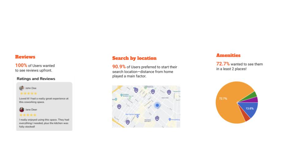
Users have issues with locating information about the spaces.
Users have problems with finding a space that fits their practical, comfort, and emotional needs.
Booking process is difficult in general (technical issues, etc.)
Problems from the Client’s Perspective-Our client revealed 3 main problems:
Co-working operations can lose money on unused space/repeat members that use space frequently.
Users are frustrated that they can’t use different workspaces at once.
Design of other apps like Popdesk or Deskpass makes usability an issue.
Target Audience- Following our user research we found that users fell into a wide range of categories:
Young workers looking for a space with a community vibe.
Parents wanting to take a break from their kids.
Teams and execs looking for larger meeting spaces.
User Personas- From our research, we built two user personas to lock in who our target user would be.
Persona 1- John: Users like John work a hybrid job, splitting their time between the office and WFH. He’s looking for a convenient, comfortable co-working space.
Needs and Goals:
Comfortable space that isn’t a cubicle and doesn’t feel confined
Looking for an open, energetic vibe and sense of community
Frustrations:
Spaces are often cold—would love creature comforts like a break room, fridge, coffee, natural light, and plants
Feels claustrophobic, unproductive, and distracted in small spaces
Persona 2- Cheryl: A Director of Operations for a major ad agency. Since her agency is giving up its expensive lease due to the pandemic, Cheryl needs to find a more cost-effective working space. She feels that what might be a temporary solution now, could potentially be something permanent.
Needs and Goals:
Her agency’s lease is too costly, so she’s searching for a new space!
Needs office space for 100 employees, and there should be a variety of room sizes.
Needs flexible terms for at least a year due to the pandemic.
Needs a coworking app with legitimate inventory in real-time.
Frustration:
Ideal spaces are often snapped up quickly as more companies end their leases
Problem Statement-Users need a better app to find and book a coworking space so they can focus while they work.
Surveys- After we came up with our target audience and synthesized our research, we made a survey and sent it out to 20+ people. who participated in helping us gather information to aid in information architecture.
User Flow- This is the user flow my team designed of how users would navigate throughout our product to book a room as an individual and for a larger group with the goal to ensure there were no problems while navigating the app.
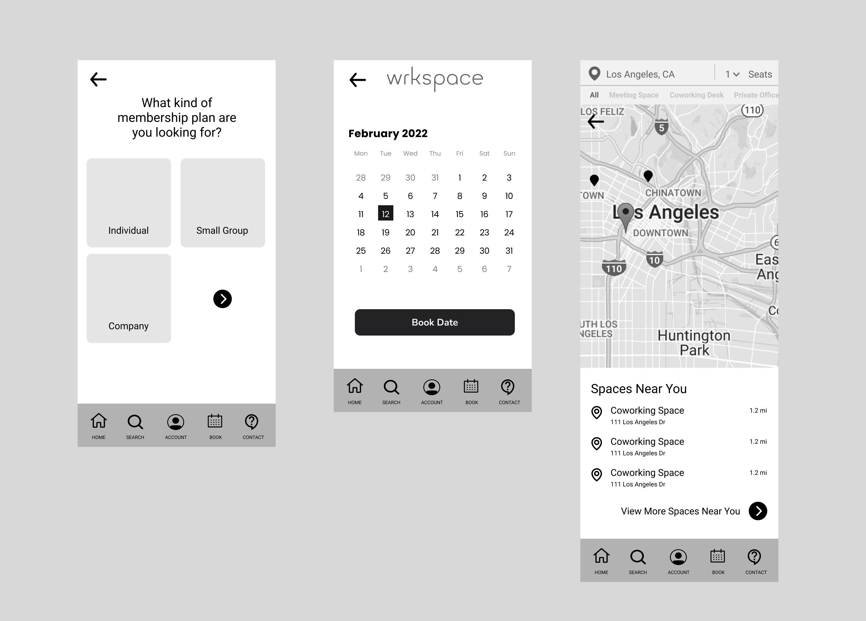
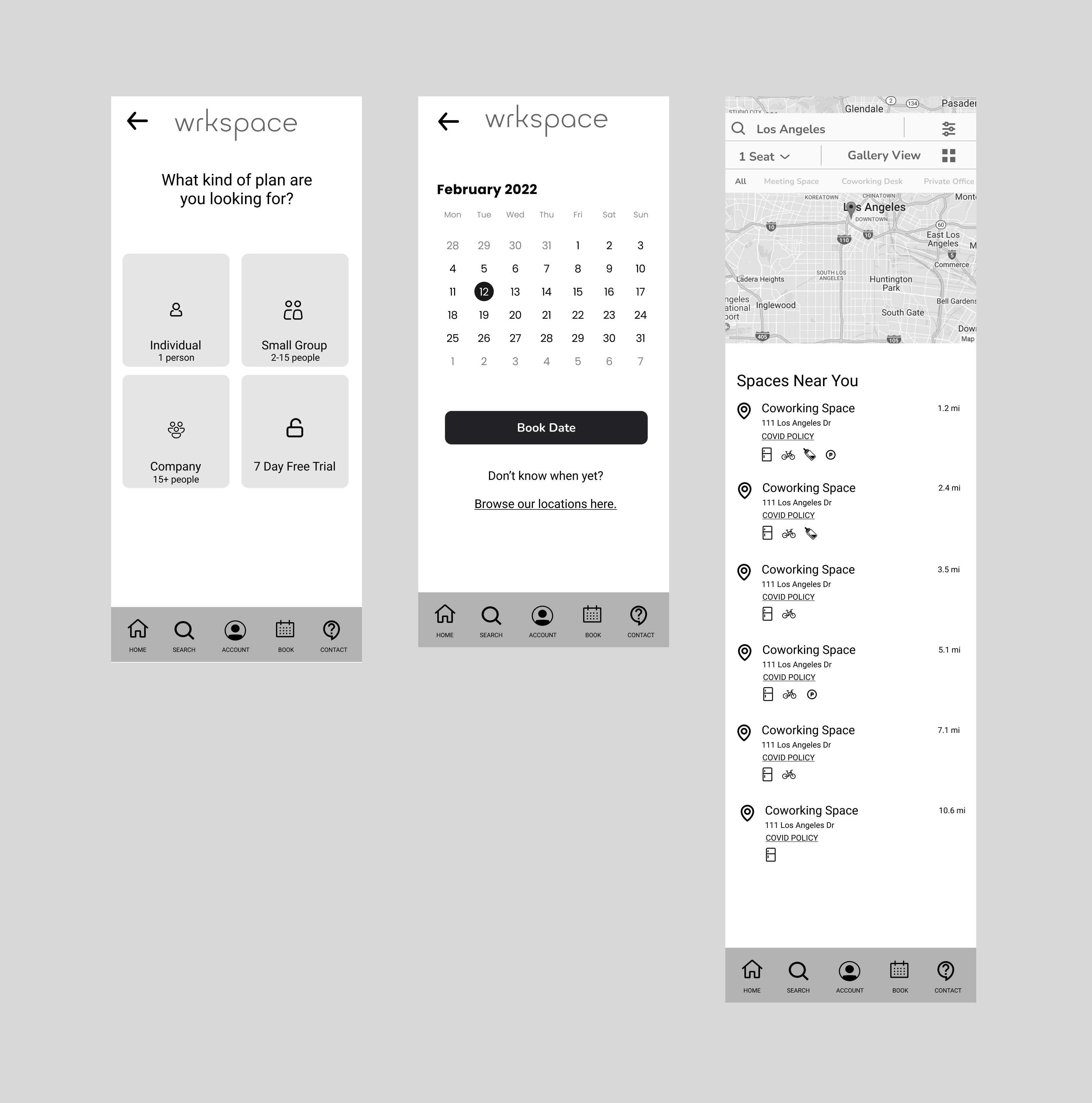
Lo-Fi Wireframes-From our user flow, we convened as a group and developed the first iteration of wireframes to test with users.
Feedback- We ran usability tests on our lo-fi wireframes, the objective was to have our users try and book a coworking space for both an individual user and a large company. We discovered that our testers enjoyed the flow, content, and ease of use, but we were able to identify areas to improve.
How It Works page:
The problem- The page was not working. Users thought that the 3 blocks were clickable options instead of steps. In addition, the tiny arrow was confusing to the user.
The solution- We removed the blocks so that the copy would look more like steps than a clickable button. We also solved the Free Trial confusion by redirecting to Get Started.
Membership page:
The problem-Users were again confused by the little arrow button, some thinking they should bypass the number of people.
The solution-After a few rounds of testing, we found the clearest way to the Free Trial was on this page, so we added the button here, replacing that pesky little arrow button.
Browsing as a Guest:
The problem-Many users wanted to be able to check the spaces and amenities first without having to Sign Up or Sign in.
The solution-In our iteration we added a Browse as a Guest option. We had the business in mind when we made this change since the idea was to sign up for the app.
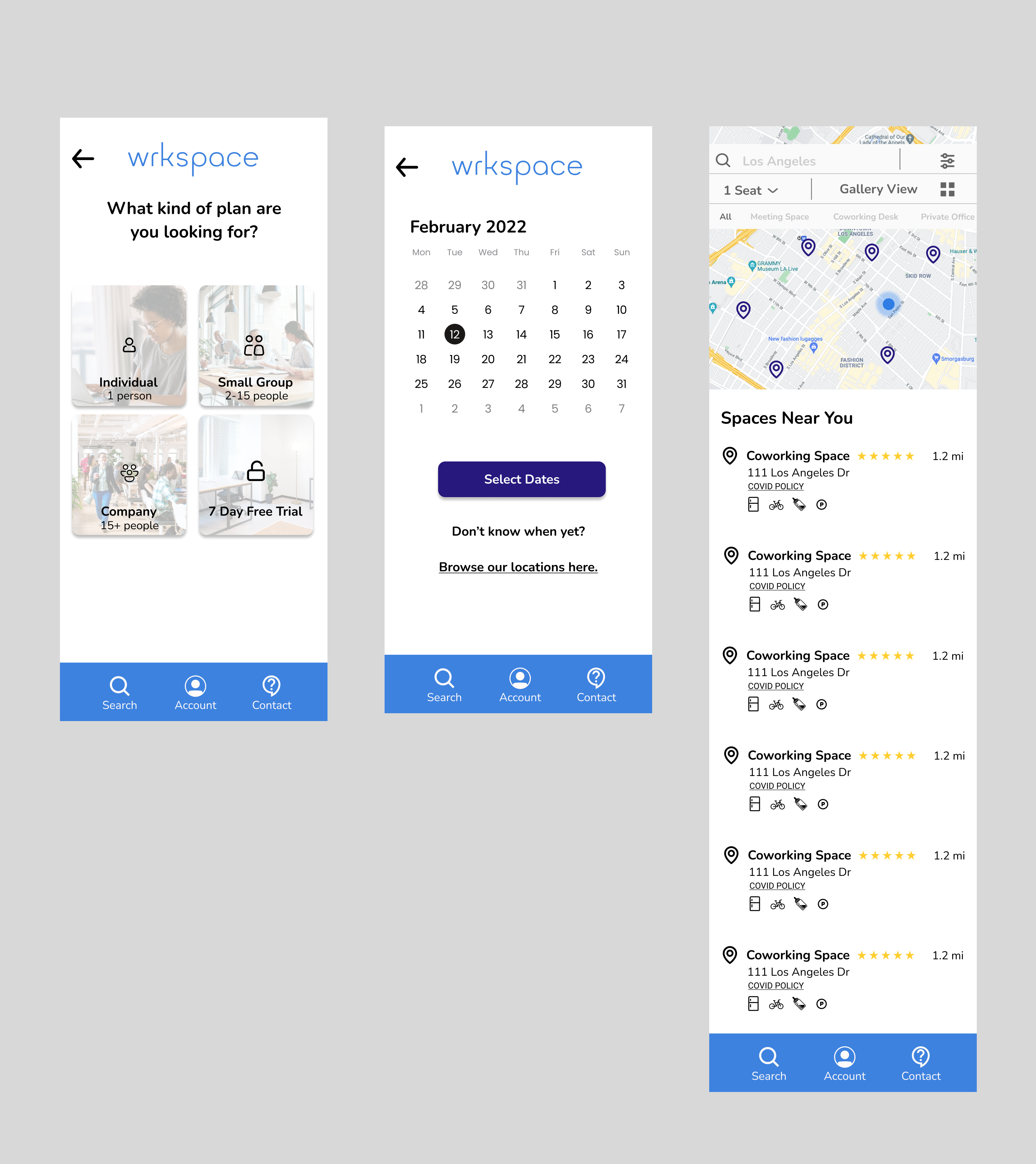
Mid-Fi Wireframes- After our low-fidelity usability testing, we iterated on our designs to solve the problems or needs our users were having. We performed another round of usability testing on our mid-fi wireframes and discovered a further issue to iterate on:
Choose Location page:
The problem-The page map area was too large for Users to see any of the property listings. Users also wanted the option of having both list and gallery views.
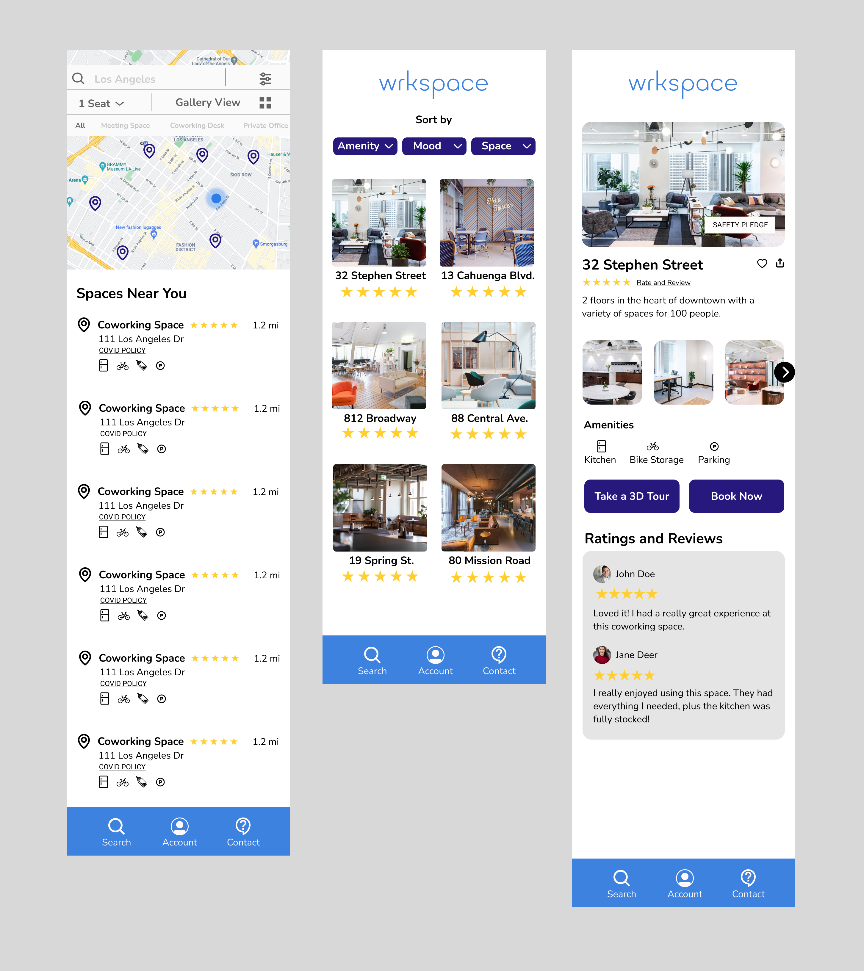
The solution-We reduced the map area so that Users could see the list view. We also added a Gallery View option and redesigned the header to make it more clear for the User.
Hi-Fi Wireframes- After making our final iterations, we added in color and put the finishing touches on our high-fidelity wireframes.
Conclusion/Next Steps:Stephen was very impressed with our final iteration. He graciously sent us gifts to reward us for our hard work. With our job done, he plans to hand them off to a developer once he secures more funding.
This website uses cookies to improve your web experience.